

Anjali Agrawal
Data Science Enthusiast
Visualizing any data can help the users to understand and interpret results faster and easier.
This article is about preparing the data and visualizing it in animated form so that we can see a clear and appealing picture of the data set. For this article we have taken dummy data for accidents from year 2009 to 2017. Here,we have provided a step-by-step guide from importing the dataset to visualizing it in animated form in Rstudio.
Working with Data
From getting started with R to creating amazing and visually appealing plots is a wonderful path to go on and the concepts are easy to digest as well. R is now becoming a very interactive and user friendly programming language to learn and also to code on with great ease.
R studio comes with the in-built packages which help the user to code some simple syntax for creating any kind of charts that you can imagine of according to the dataset you have. Let us now start with visualizing the bar plot. Before starting to code and go for the process, here is a preview of the plot that we are going
to create step-by-step in this blog.

So, this is the chart that we are going to create in R. The packages and libraries that will be useful for us to create this plot should be downloaded first before getting started for coding. These packages can be
So, this is the chart that we are going to create in R. The packages and libraries that will be useful for us to create this plot should be downloaded first before getting started for coding. These packages can be listed below:
1. caretAfter installing these packages start with importing the data set into R working environment. For our convenience we have imported a csv file, but R also accepts importing the dataset stored in different formats such as excel file, JSON file etc.
After importing the dataset have a look at the data once to see how the data we are working on actually look like. The data set we are using here is saved as Accident_data variable name in R workspace.

Now when we have selected the desired rows and columns, our working data set is ready to be analysed. The next step is to some preprocessing and formatting our dataset such that we get datasets having different names and every dataset should have three columns. These columns should be as follows:
a. Name of the districtThis can be illustrated through the following set of code.

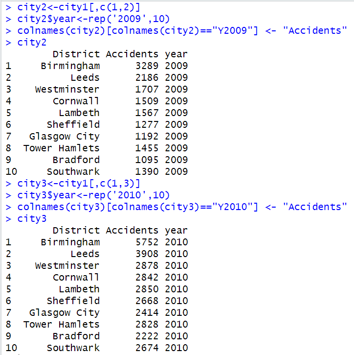
The series of code should be executed in the same manner as they are shown in the figure above. A set of four lines of code is to be repeated till ‘city10’ variable name as per the sequence we follow or until we create column of replicate value for year 2017. This series of codes can go on if there are more columns in your data set.
In the first line of the code we created a data frame that takes all the rows and only two columns of our working dataset. In the next line we have created another column which replicates the year given as input in rep() function for ten times. The third line of code in the set of the code change the column name that takes in the number of accidents city wise to ‘Accidents’ variable name. And next code is to display the resulting dataset we have created through rest of the codes of the series.
This pattern of data set is created in order to combine them afterwards and create a new data frame that will be used in the animation part of the bar plot.
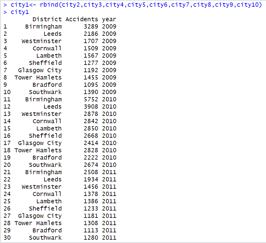
After creating the data sets, we will combine these data sets row wise with rbind() function. The ‘city1’ data set is overwritten by new data set created with rbind() function and joining the datasets from ‘city1’ to ‘city10’. The following set of result is generated with this function:

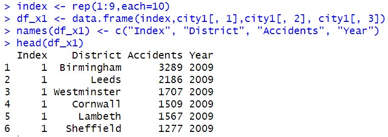
For the next step, we have created another column for giving the index to the ‘city1’ dataset that we have defined in the previous step. Further, we will create a data frame naming ‘df_x1’ with the ‘data.frame()’ function. This data frame will have the index column and the rest of the columns from the ‘city1’ dataset, including all the rows from ‘city1’ dataset. Next, with the ‘name()’ function we will change the column names of the ‘df_x1’ data frame. These steps can be demonstrated as follows:

In the next step, we will create a duplicate column of the ‘Accidents’ column and name it as ‘Accidents1’. The type of the new column created is changed to the ‘factor’ type with the help of as.factor() function. Check for the data types of all the columns of the dataset with str() function. These codes are executed in the following manner:

The next code is given for creating the animated bar chart. The code written in R for this purpose is designed in the following way:

The ‘ggplot()’ function takes in the name of the dataset as the first input and then the column names for X and Y coordinates inside the aes() parameter. The ‘geom_bar()’ function makes the height of the bar proportional to the number of cases in each group. The ‘labs()’ function gives title to the chart which takes input from the ‘transition_states()’ function. The ‘geom_text()’ function provides labels to X and Y coordinates. With the ‘theme_...()’ function you can provide background theme to the plot. The ‘coord_flip()’ function is used to flip the plot axis and this will create a horizontal bar chart. The ‘enter..()’ and ‘exit_..()’ function is used to provide the kind of flow in which we want the bars to enter and exit. The ‘ease_aes()’ function controls easing of aesthetics in gganimate package.
The execution of the above code results into our animated bar chart:

As the concluding part of the article we have converted the above framed chart into gif format and this will give us a gif file in our local machine folder. The following figure will show how to convert the animated plot into gif format.

The gif created through the execution of the above can be located and seen in the desktop folder by searching the files with ‘.gif’ extension.
Thank You
Don't miss the text