


Sachin
BI Developer
In this blog, we are going to learn about the reports and dashboards I created on the predictive data of accidents in Uk. At first I received historical data of Accidents in the UK. Then I created a data set on it in SQL Server. Accident Severity was divided on 3 types that are Slight,Serious and Fatal. The prediction on this data has been performed in Python. After performing prediction I received prediction data. I used this data in Power BI to compare it with historical data.
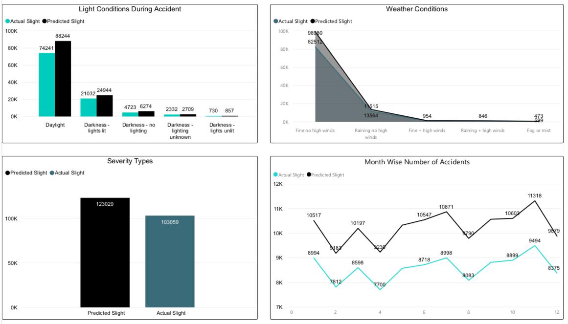
This is a dashboard on Light and Weather Conditions. It is showing that predicted number of accidents in daylight conditions are the most and greater than the historical data. Severity in which number of accidents are most is Slight.
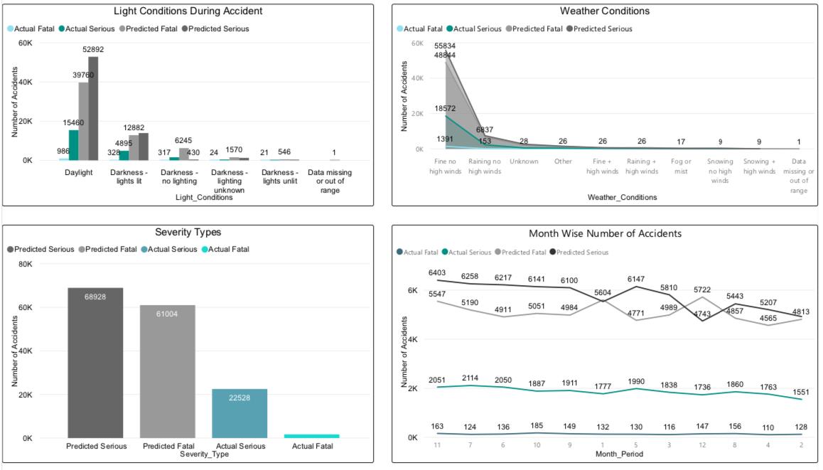
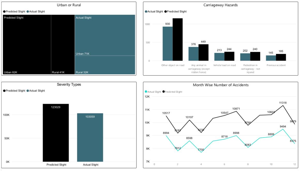
As per this dashboard, Urban areas in the UK are more likely to have accidents then Rural areas. Predicted values are also showing the same result. Most of the accidents happened due unidentified object on road and number of accidents happened due to animals in carriageway hazards on second. Slight Severity type is most likely to occur as per the reports showing.

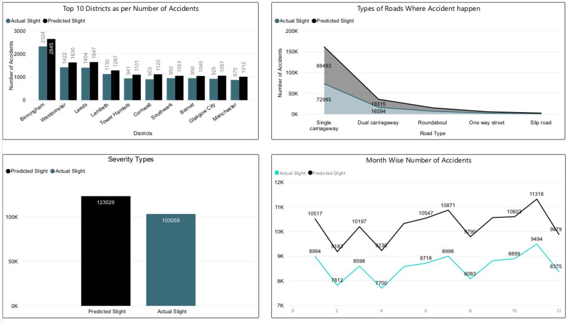
Predicted values are showing that Birmingham city has the most number of accidents. Single carriageway are most likely to have accidents with Severity type Slight.

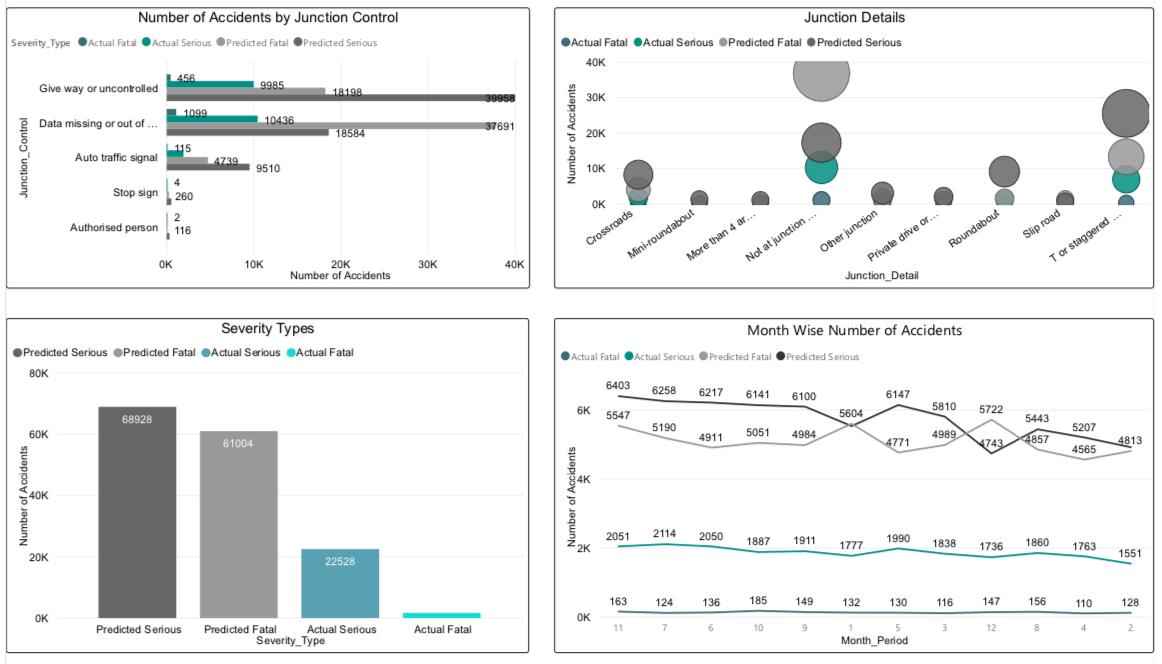
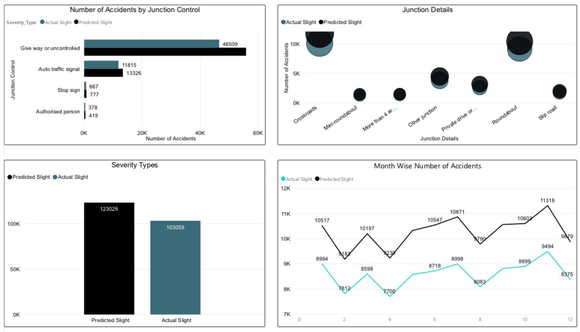
It is showing detailed information about the junction type. Most accidents happened in Auto signal
Don't miss the text