


Sachin
BI Developer
For organizations developing Power BI reports, there is typically a strong desire to design them in a way that provides the best user experience. This includes not only providing excellent data visualization to meet reporting needs, but also designing reports for optimal performance. Too often the burden of performance optimization is placed solely on IT or Power BI administrators when it should be a function of anyone using the tool.
In this blog I am going to tell about the reports and dashboards I created on the data of accidents in UK.
Firstly, I imported this data if accidents from years 2009 to 2017 into SQL Server, where I created a data set named Accident_Info. After creating the dataset, I transferred it into Power BI to do some visualization.
Here are some reports I made on accident data :
1. Month and Year Wise Number of Accidents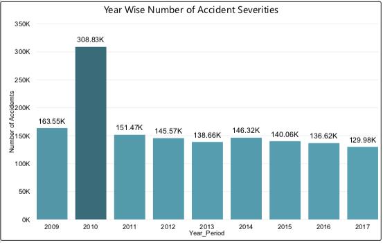
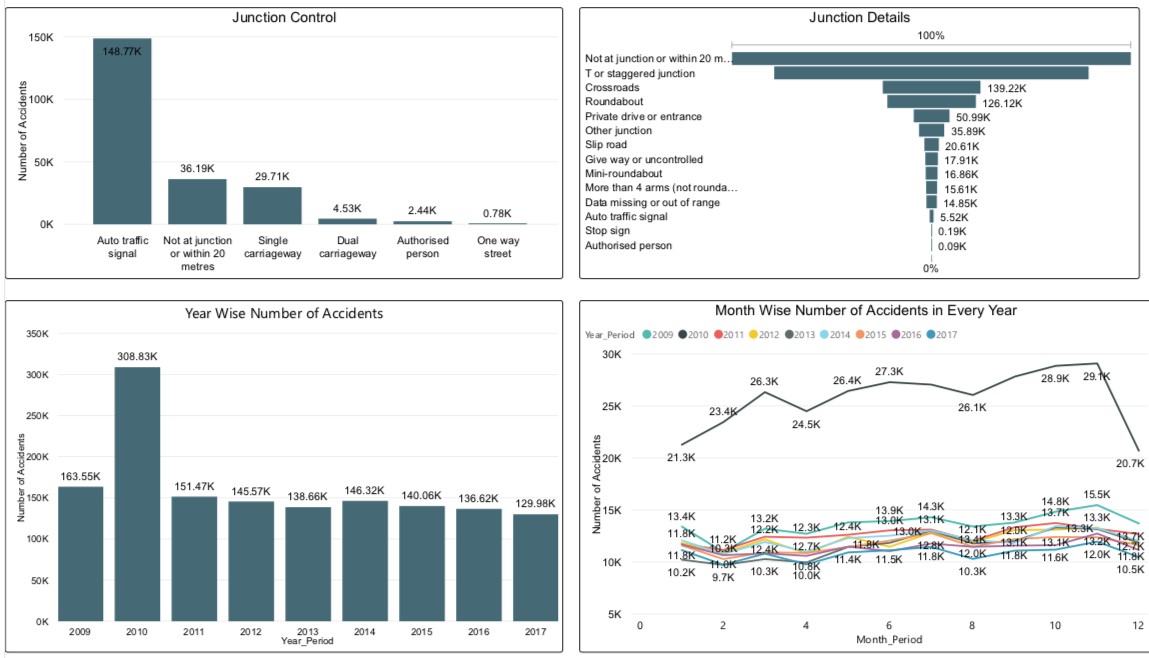
First report I made on number of accidents happened in UK in every year from 2009 to 2017, as a bar chart where X axis is Year_Period and Y_Axis is Number of Accidents. This report shows that most accidents happened in the year 2010. Which is about 308.83K (Where K = 1000).
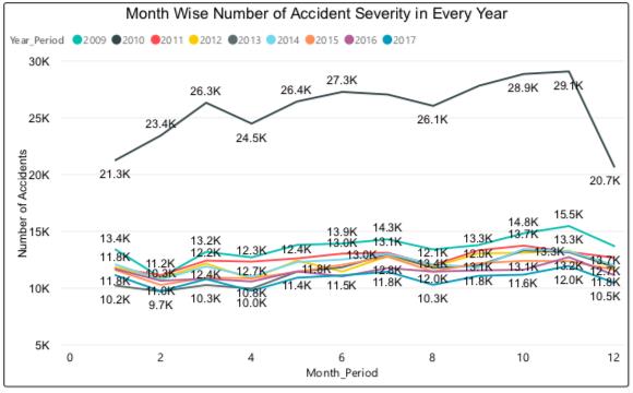
After making year report, I made month report. Which shows that most of the accidents happened in the month of November in many years. This line chart looks bit rough. But there is a feature in Power BI that connects one report to another if both reports belonged to same data set. An example has been shown below.
The figure below is showing the number of accidents in the year 2017 in line chart. It shows most of the accidents happened in the month of November in 2017. We can select two or more years simultaneously in bar chart and it will show the result of selected years in line chart as if to compare the results of different years.

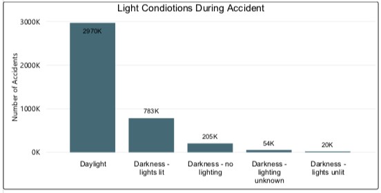
This bar chart shows that how was the light condition during the accident. Most of the accidents happened during Daylight conditions about 2970K accidents(Where K = 1000). I have taken light conditions on X-axis and Number of Accidents on Y-axis.
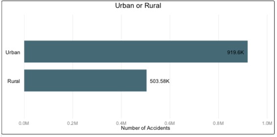
Every districts has Urban and Rural areas. So it is important to identify how many accidents happened in which area. As per this report more accidents happened in Urban areas compared to that in Rural areas.
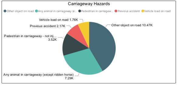
This is a Pie Chart. It is showing about the Carriageway hazards which were responsible for accidents. Most of the accidents happened due unidentified object on road and number of accidents happened due to animals in carriageway hazards on second.
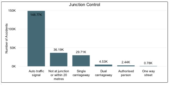
This bar chart is showing how many accidents happened by junction control. Most of the accidents happened in auto traffic signal about 148.77K (Where K = 1000). Whereas least number of accidents happened in One way street.
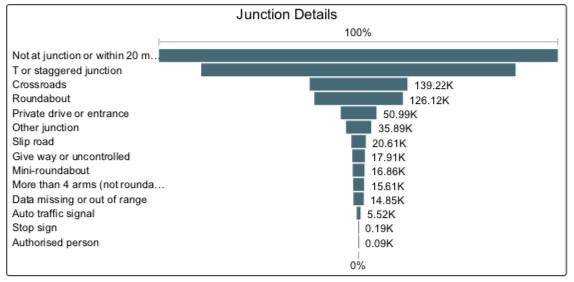
This tree chart shows about the junction details during accidents. Most of accidents happened either not at junction or within 20 meters
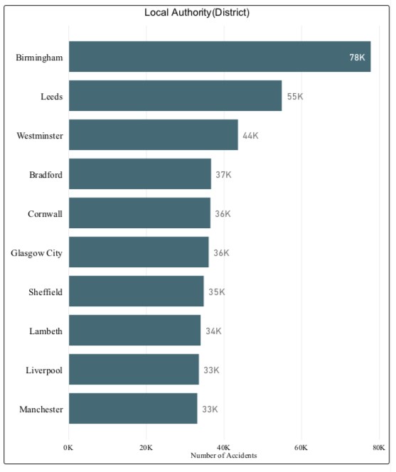
This chart is showing the top 10 list of cities in UK where most accidents happened from year 2009 to 2017. Birmingham has most dangerous city interns of accident. It has number of accidents during this period, about 78000.
This bar chart is showing the number of accidents happened as per types of roads. Most accidents happened on a single carriageway road type
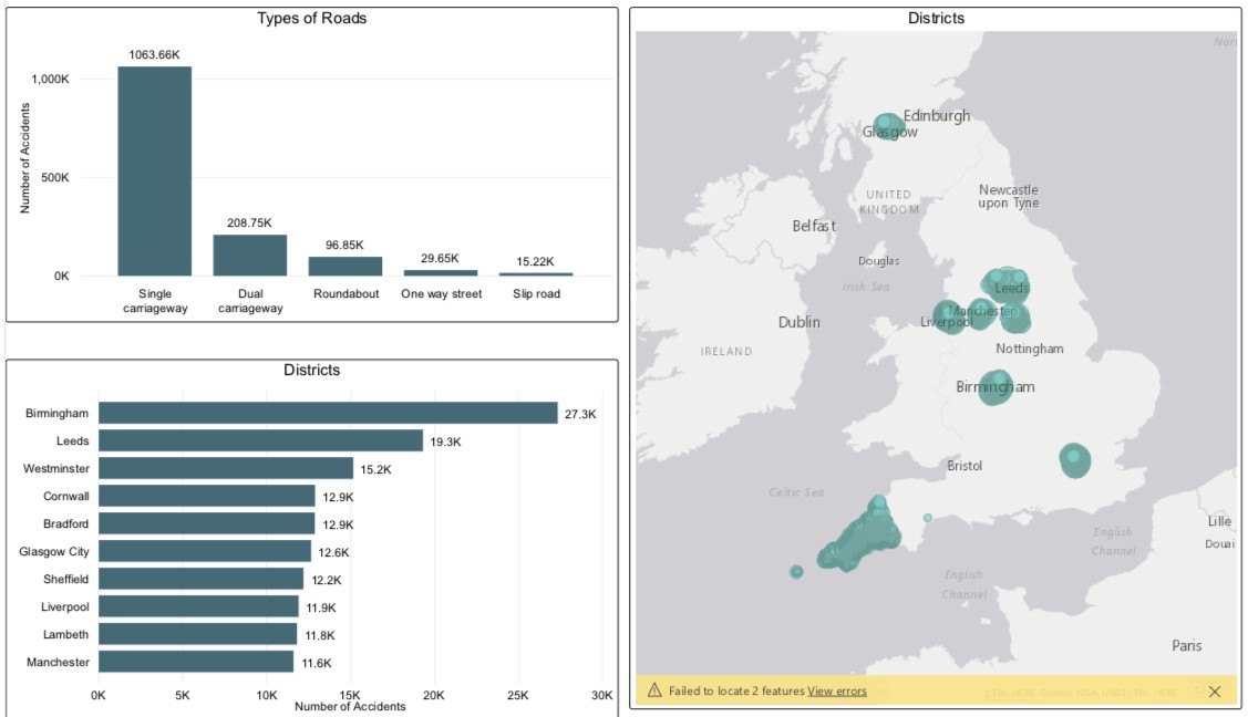
After creating some reports, I have created dashboards by combining reports that I have showed above. Dashboard is a single page, often called a canvas, that tells a story through visualizations. The visualizations on a dashboard may come from one underlying dataset or many, and from one underlying report or many.
Here are some dashboards I made on accident data:-
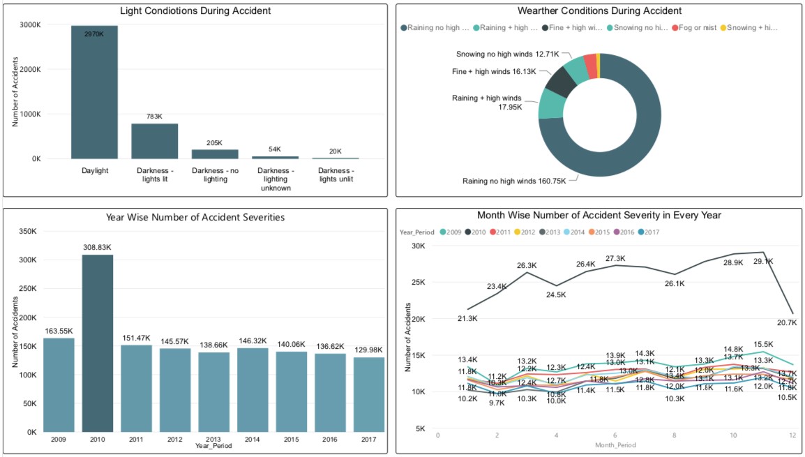
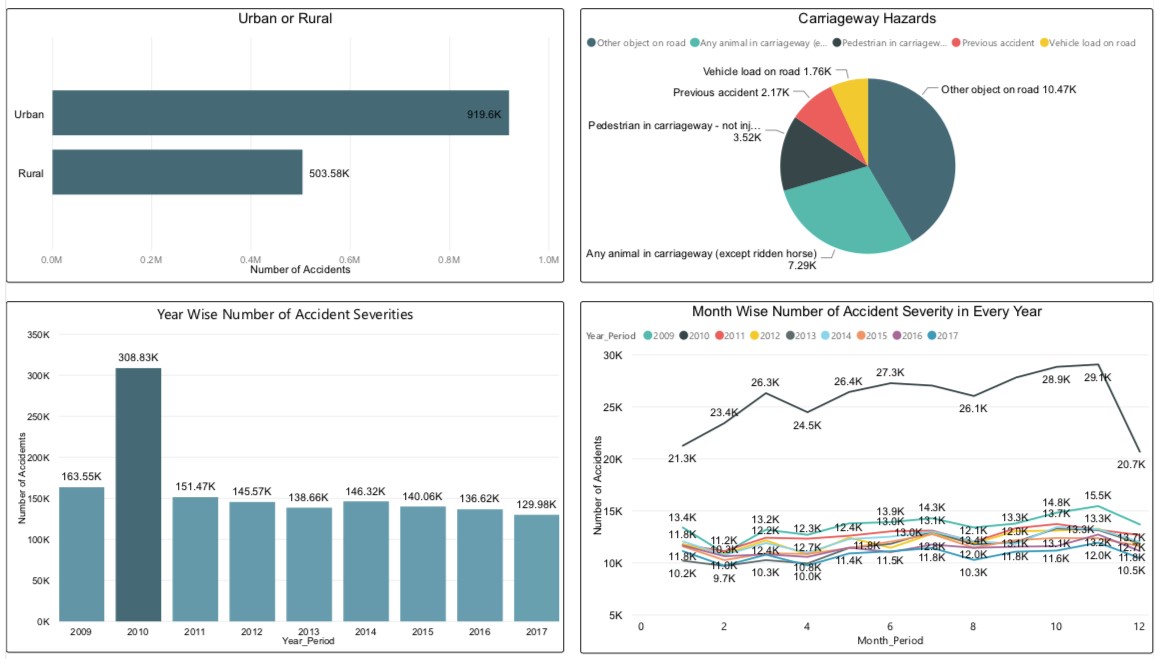

Number of accidents happened the most in Birmingham city during period of 2009 to 2010. Year 2010 was most dangerous year in terms of accidents. With about 3.81 lacs of accidents during that year.
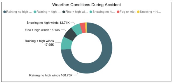
Urban areas are more likely to have accidents compared to Rural areas. Most Accidents occurred during rain with no high winds.
Auto traffic signals are responsible for most of the accidents.
Don't miss the text