


Pruthviraj prasad salvi
In this blog you will be looking at the statistical analysis and visuals of the indian premier league dataset.The dataset is fetched from website named “Tableau Public”. The dataset contains records from the year 2008 to 2016. The visualisations in this article are mainly influenced by attributes like batsmen runs count, bowling records and player performance. So, let's get started with working with data and making useful visualizations.
On this data of IPL we have analysed different types of reports in which we have described in many worksheets and we have done formatting and editing in data which we can present in spectacular way.Tableau has very rich feature which allows you to customize your reports.According to visualize the data we have done formatting in which you will see static data in a proper way.
We have done formatting through format and edit tools in tableau. We have created different measures using calculated field feature in which you can personalize and create your own measures accordingly and to create new graphs in tableau.
The following reports are prepared using the IPL data:
1. Pyramid chart of runs scored in each over
2. Butterfly chart of number of matches in each stadium
3. Funnel chart of highest hitting percentage
4. Lollipop chart of highest runs overview
5. Orange Cap overview by bubble chart
6. Purple Cap visual graph by tree map chart
7. Area chart of match statistics overview
8. Donut chart on Winning Teams
9. Host Country Map visualization
10.Bar graph of Matches Won Visuals
Let us discuss them in detail with their respective graphs and charts.
Pyramid chart of runs scored in each over.
In this graph you will see runs scored in each over
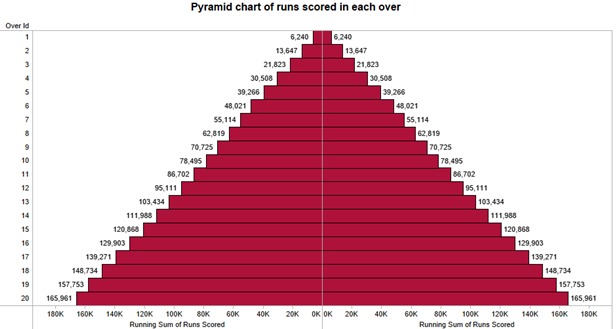
This graph shows how much runs score in each over in IPL in which we have to put over id rows and then we have to put sums of runs scored in measures field in columns twice and then right click on sums of runs scored you will see quick table calculation in which you have to select running total in which you will get total runs score in each over and then you have to edit axis of running sums of run scored so you will get pyramid chart.
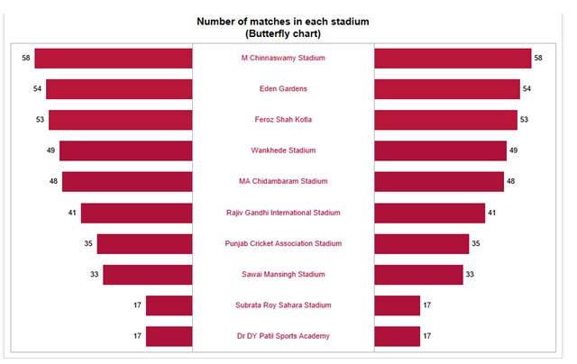
This butterfly chart in which we show the venues in ipl, firstly you have to put venue name in dimension and no. of records to take twice in measure fields and after you will get bar chart side by side and then you have to right click on the left side of the header of number of record to edit axis in which you have to tick mark on reverse option after that it will take the shape of butterfly and then you to create calculated field of zero axis and to write 0 in calculating field and put this zero axis calculated field between no. of records which will give you one separate line and then right click on zero axis in column field and change mark type to text.
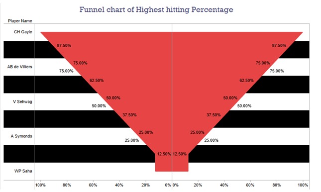
In this graph you will see the highest hitting rate of top players and you can also change the graph pattern or colour in different manner and we have put new measure field to bring new calculate field of strike rate in which we (SUM([Runs Scored])/Count([Ball Id]))*100 and we will get our new calculated field and it will show the impact of player of how much they are dominating the match and you can assign different colour platelets.
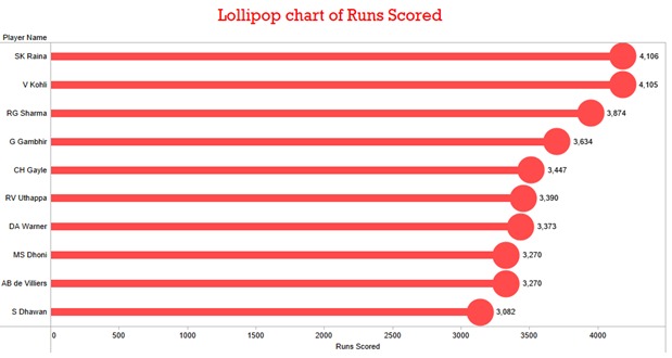
In this graph you will we see the highest score in IPL which you have to put player name in column field and runs scored in row field twice and then you have to right click on the second of runs scored and select dual axis and then select circle marks in second runs scored and then adjust the size of both axis of runs scored to make actual look of lollipop In which you will see Suresh raina has highest run in IPL.
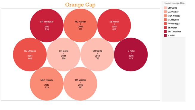
In this graph you will see which players get most of orange cap in every season of IPL. The orange cap is an annual award presented to leading run scorer in IPL. This graph is scattered bubbles graph. you can choose from show me toolbar in which we put calculate total runs of players in each season of IPL and you can change the size of bubbles and you can also show parameter of runs you want show.
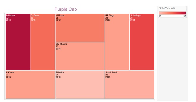
This graph shows us the most wickets taken by player and this graph is known as tree maps, if you want to use you should have one or more dimensions and one to two measures. Tree maps is used to view data visualization in nested rectangles to show us a comparison between players. If we want to overview the purple cap you have to sum all maximum wickets in every season and to count every purple cap winner in each season and you can see DJ Bravo has taken maximum wickets in single season which has been shown with dark red colour platelet.

This is an area graph in which it show statistics of every wicket, fours, sixes and matches played in every season and in this graph you will see continuous comparison of each statistical match played between each team. If you want to apply this chart you have to brought only measure fields in columns and season year in rows in which we have to take all sum of wickets, fours and sixes and after you have to select area graph in show me toolbar.
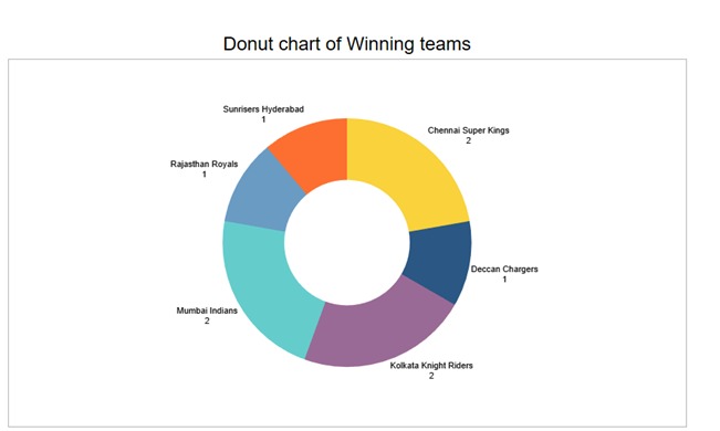
This text graph are applicable to most dataset ,they do not tell a very compelling story or highlight important pieces of data without additional formatting on your part. Consider using them as an appendix inclusion for those report in which we want more detail in traditional format instead. In the above graph we see how many times each team has won IPL season. If you want to add more dimensions in text table like sixes and fours you can easily add into it but without adding any date format in it.
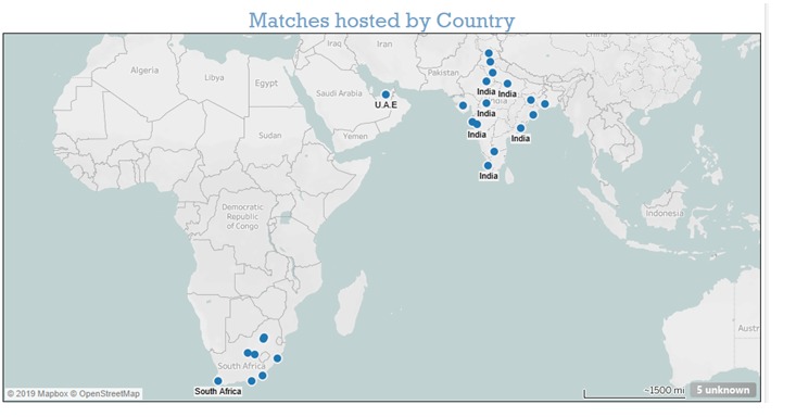
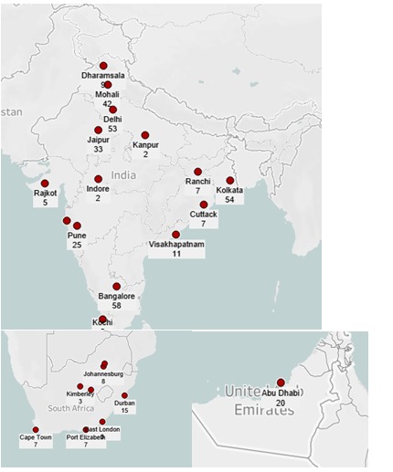
In this symbol map graph you have to put latitude and longitude of city name and country name and we have to change their geographical role to country/region to pull out their exact location and if we don't get any city location or country we have edit their location at right bottom side of graph you will see unknown label,and after you have to edit location and have to put longitude and latitude of the city. Then you have to label match id to show how many matches have been played in each country so it will show numbers on each city.
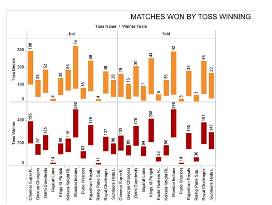
This is a horizontal bar graph in which we are showing comparison between how many matches won by a team if they won the toss and chose to bat first or field first and in this you have to take two to four measure and more than one dimension and you can also predict which team will win batting first or bowling first in the above graph you will see how many toss win by each team and decision they made after winning toss whether they bat or bowl first.
In this blog you will see different chart we can create in tableau and you can also recognize that we are able to make changes in charts which are already given or we can make our own charts by slightly changing their actual form or pre-structured forms .
Don't miss the text